FONT DESIGN
-
ILLUSTRATION
-
PHOTO ART DIRECTION
-
BRAND ACTIVATION
-
PACKAGING DESIGN
-
FONT DESIGN - ILLUSTRATION - PHOTO ART DIRECTION - BRAND ACTIVATION - PACKAGING DESIGN -
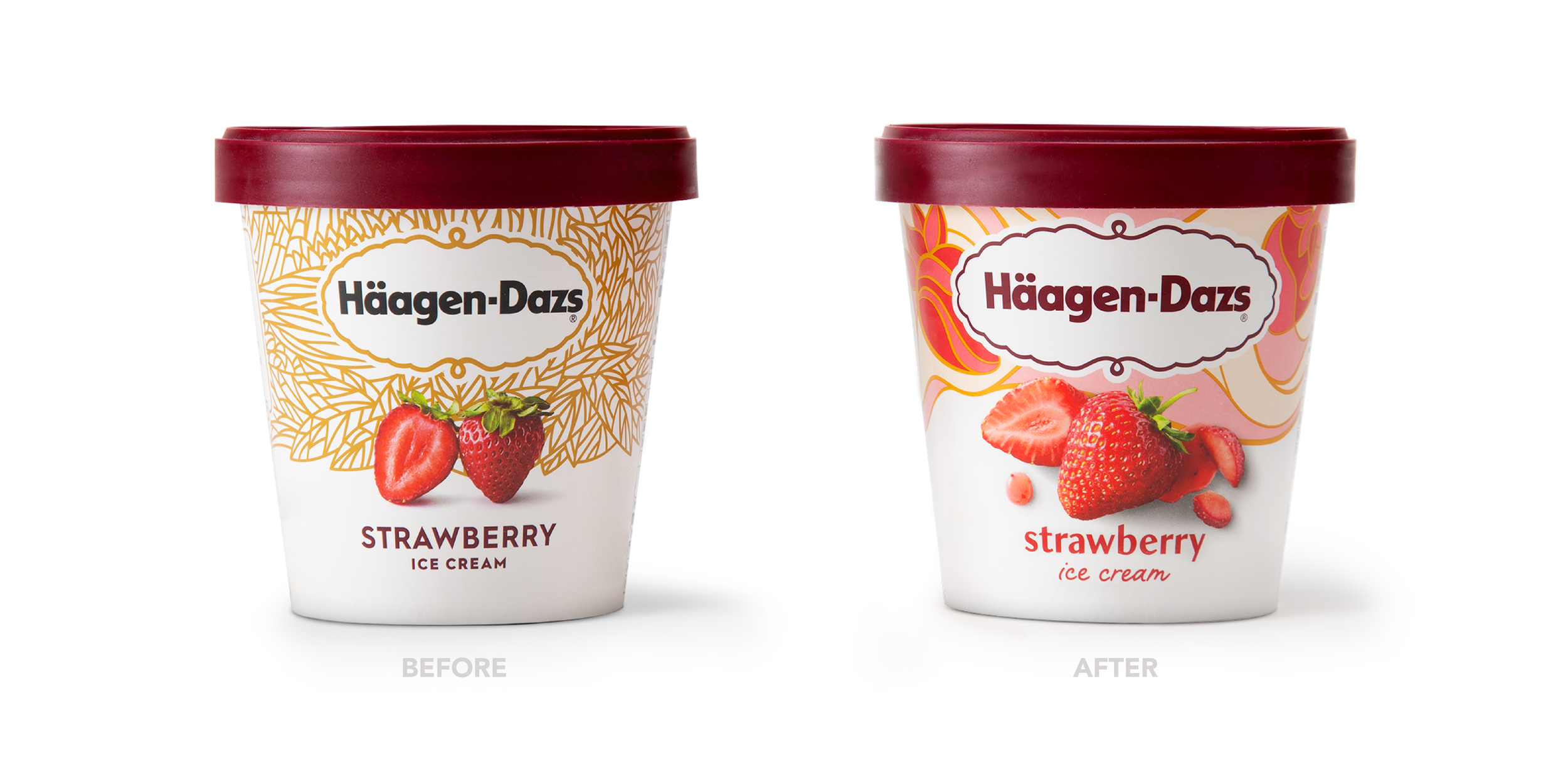
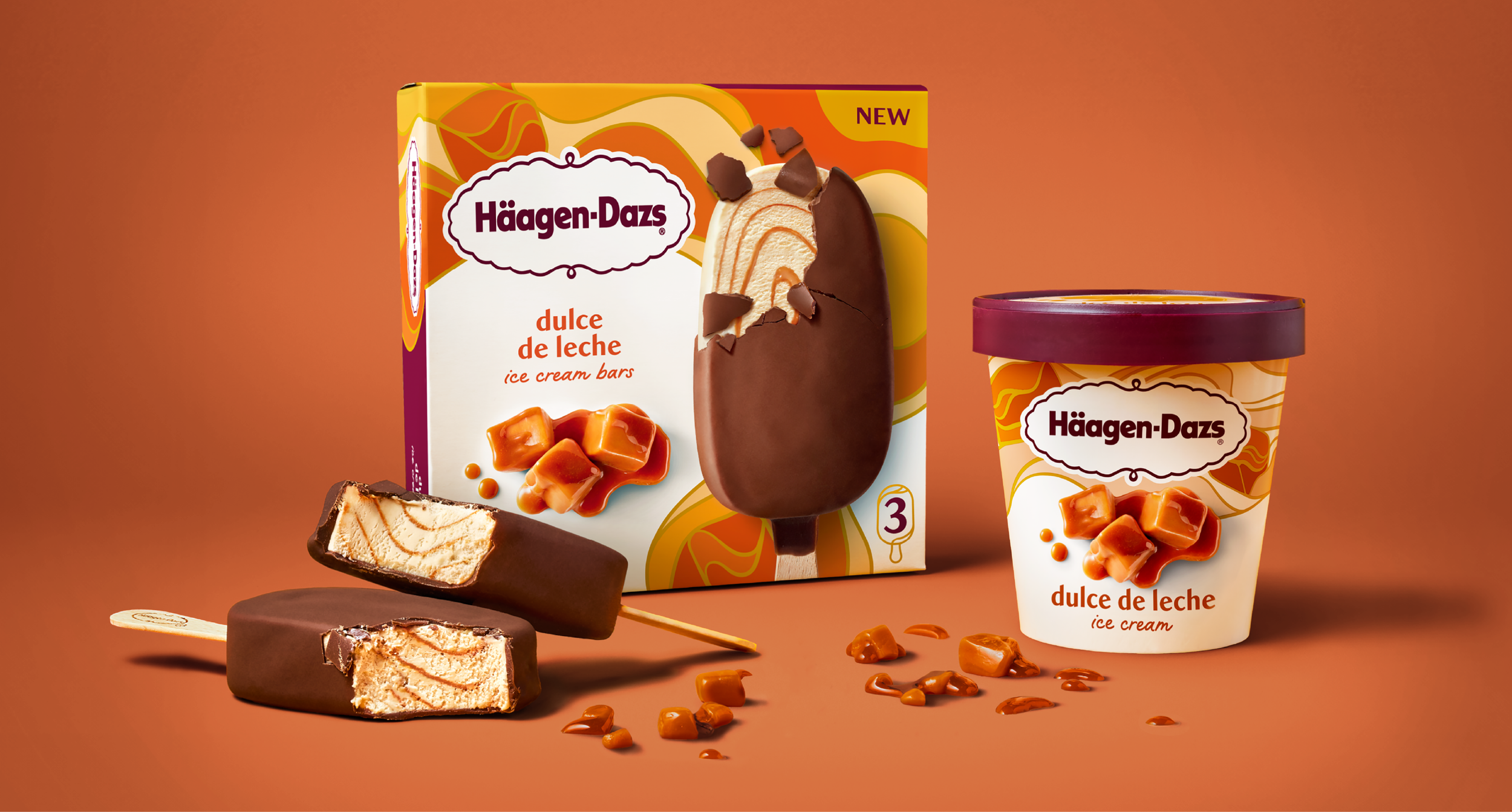
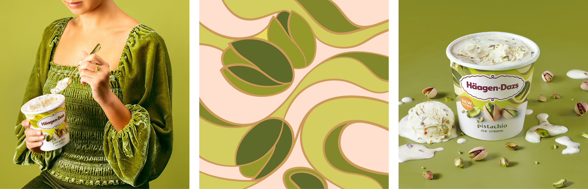
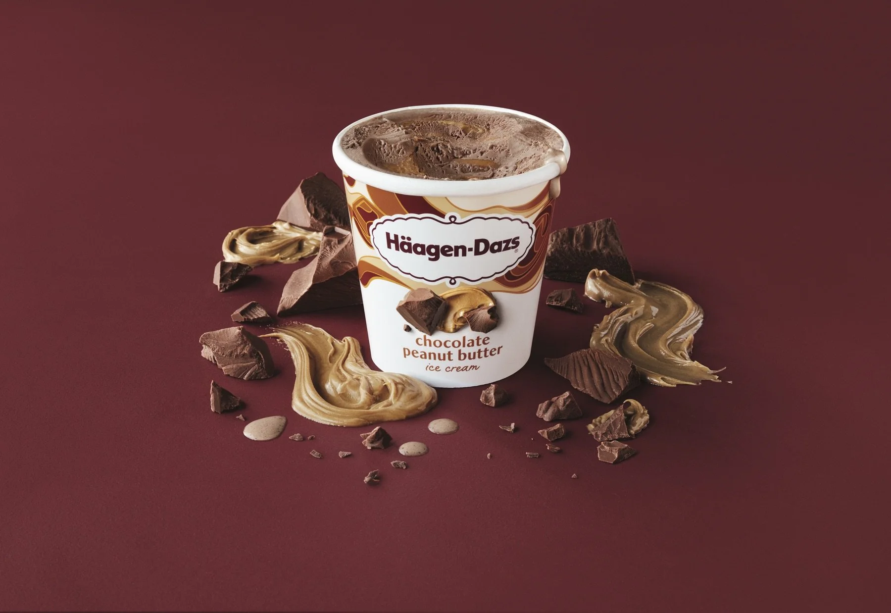
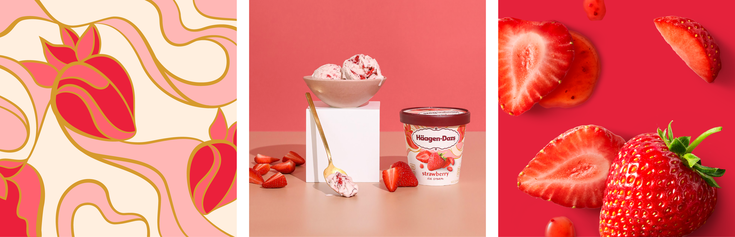
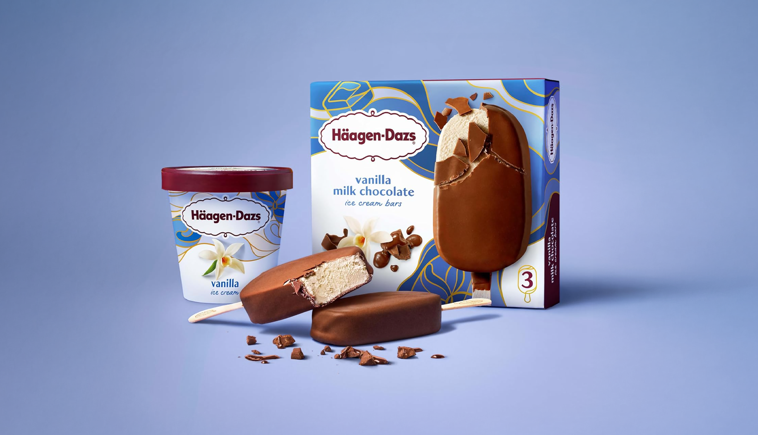
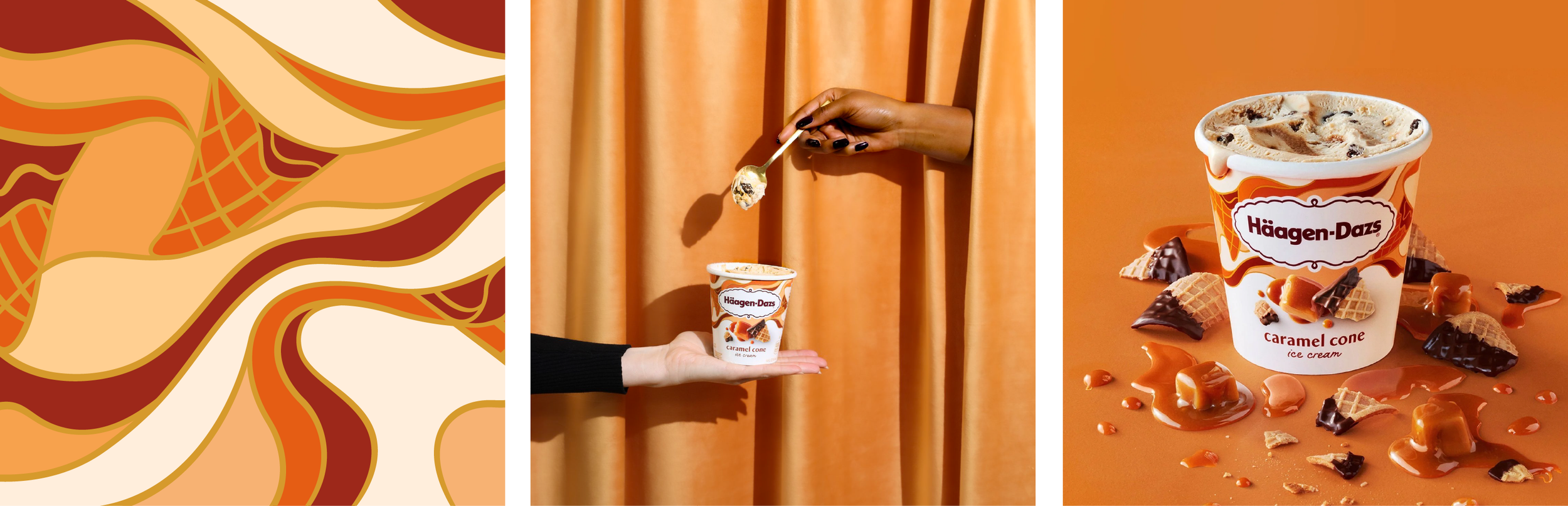
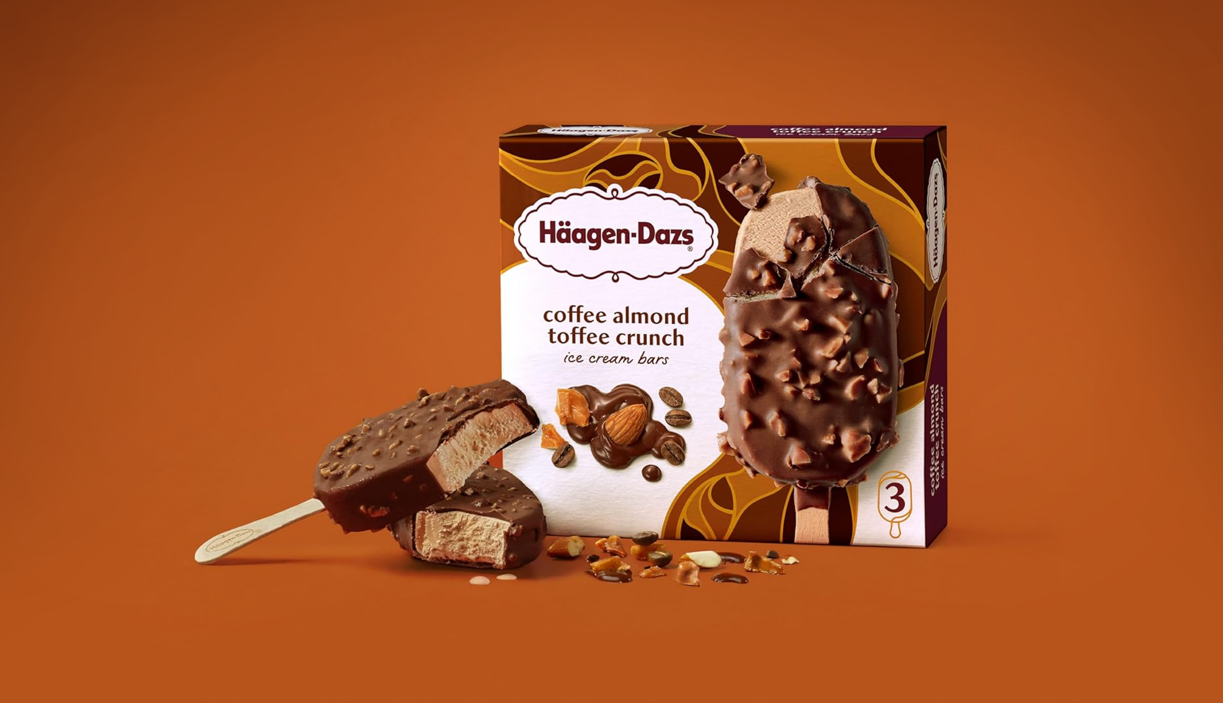
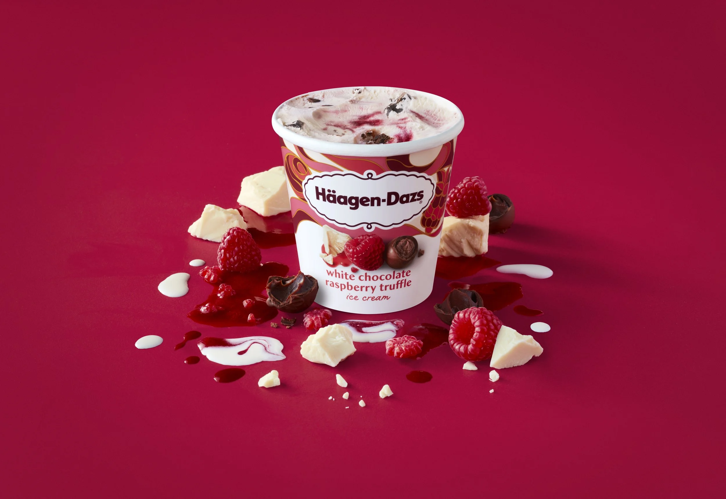
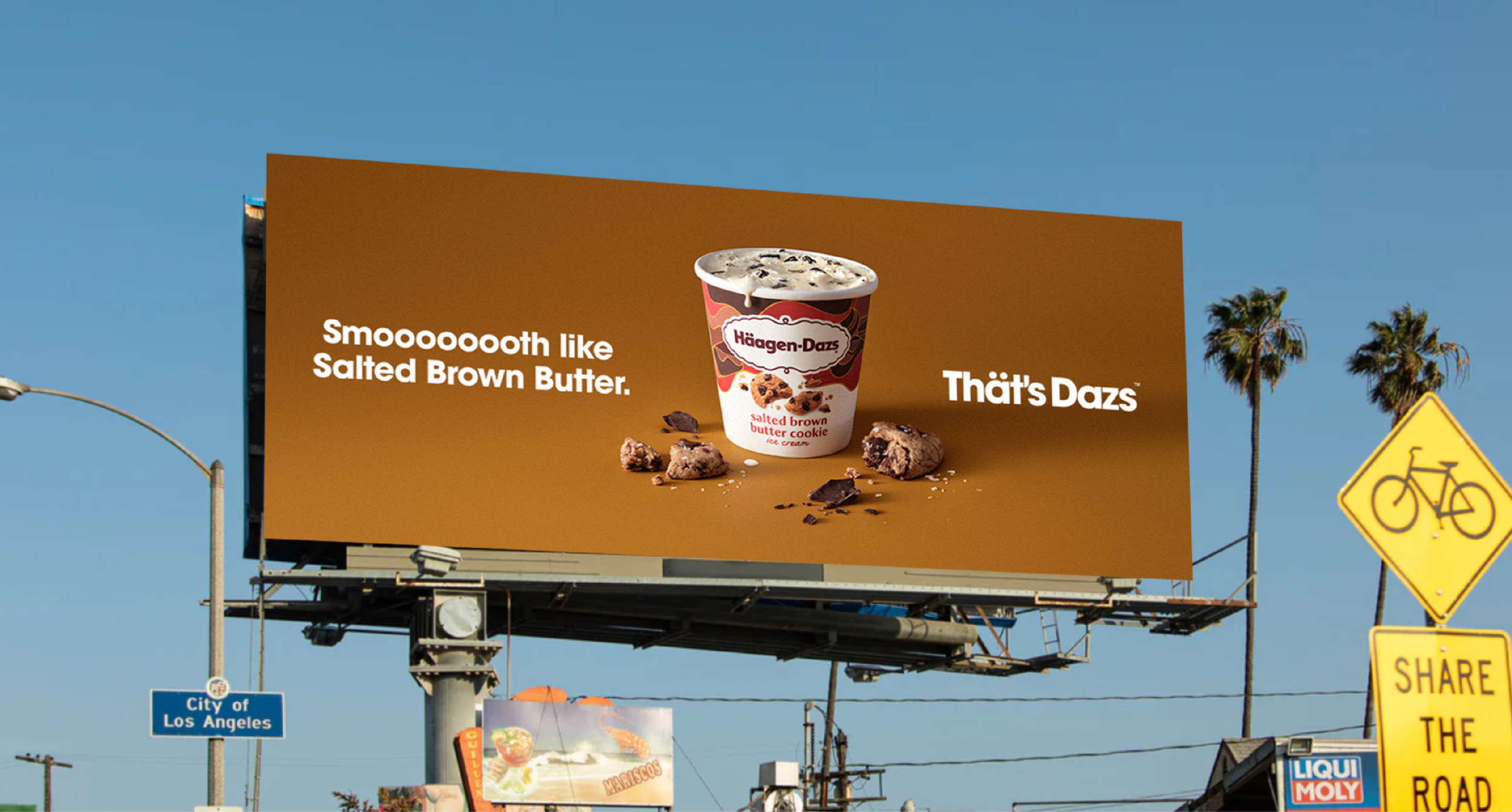
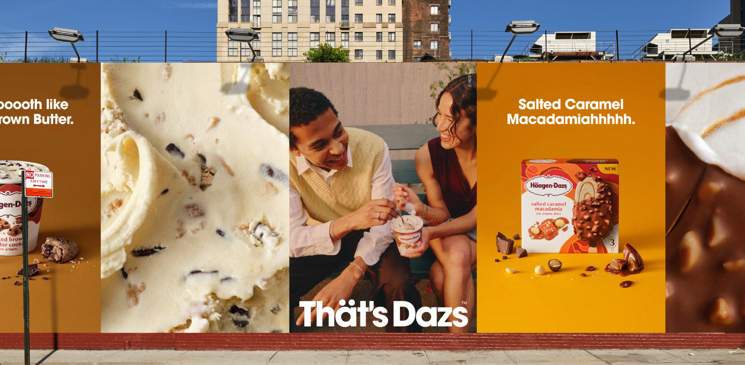
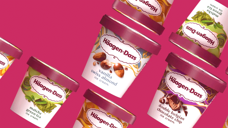
The iconic luxury ice cream brand, Häagen-Dazs, was due for a refresh. Myself and the Chase Design Group team evaluated and updated every element on pack. Unique flavor illustrations, mouthwatering photography, and a custom typeface come together to create a design that is artful, playful and pure. The end result makes Häagen-Dazs stand out on shelf compared to the new and exciting brands in the category, gaining recognition for the sheer number of flavors they carry and the pure, high-quality ingredients that go into each pint. I saw this project through from initial pack concepts, through print production, to building a comprehensive brand toolkit to support the rebrand.